 More
More
 Drag
Drag
 More
More
 Drag
Drag
Since the new visual identity was launched through an updated version of the website, there has been an exceptional response from the market. Inbound requests have grown by 21,43%, and the total number of qualified leads generated has increased by 33%.
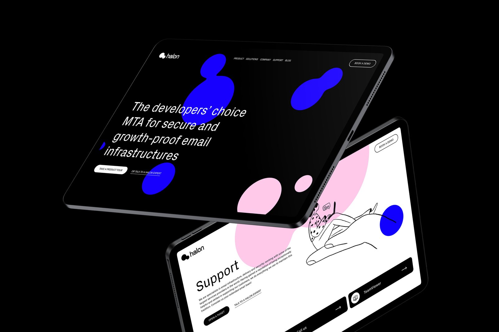
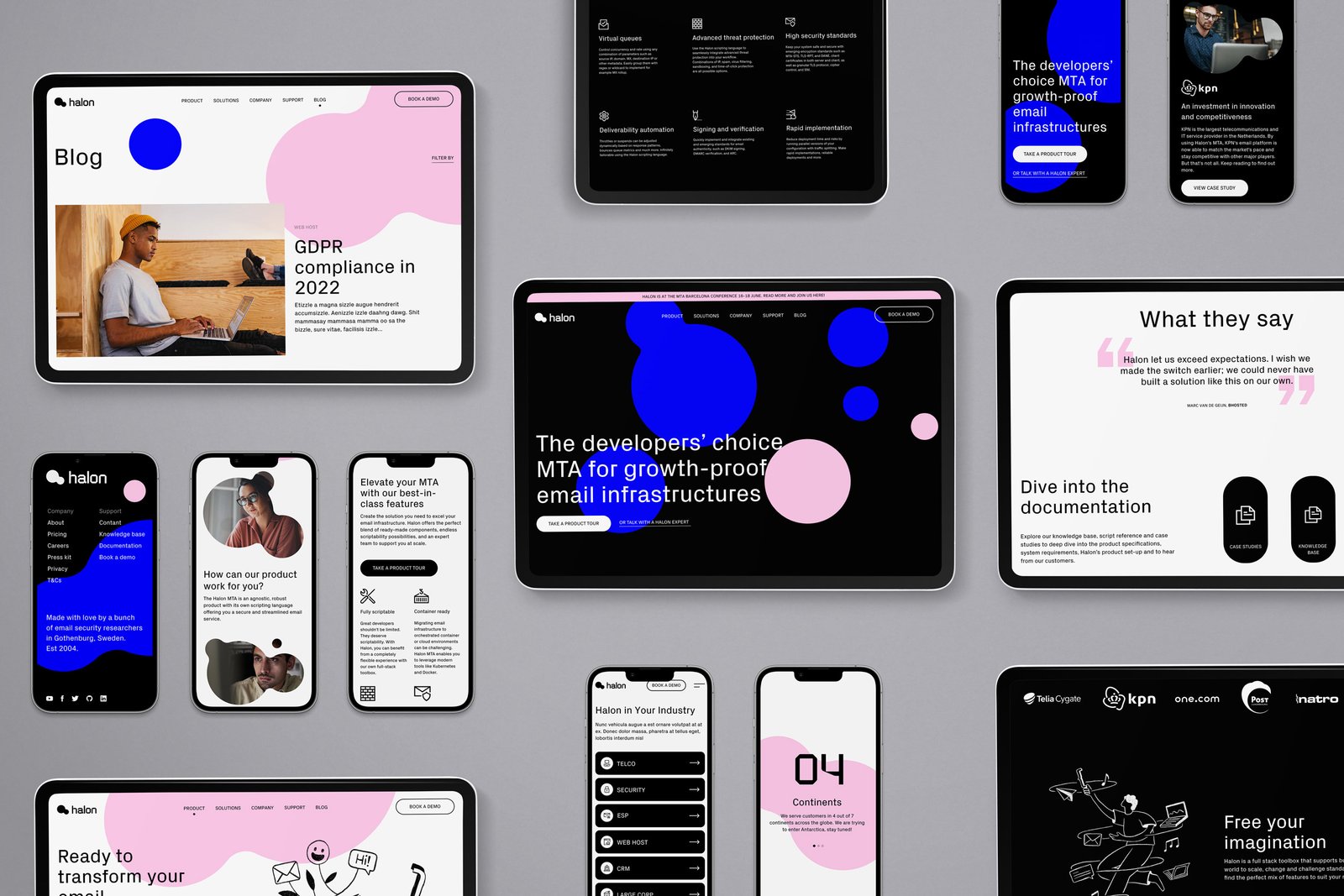
After being in business for over 15 years Halon came to Most Studios to craft its new visual identity, messaging, and website. Looking across the MTA space, there is a distinct feeling that this is “mission-critical” software for large businesses. But when you dig deeper behind the code you find the developers of each company tailoring it to their unique needs. Halon’s edge, we discovered extended beyond their approach to product, to the personal service they offer.
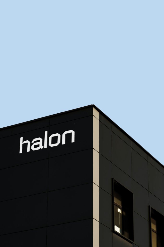
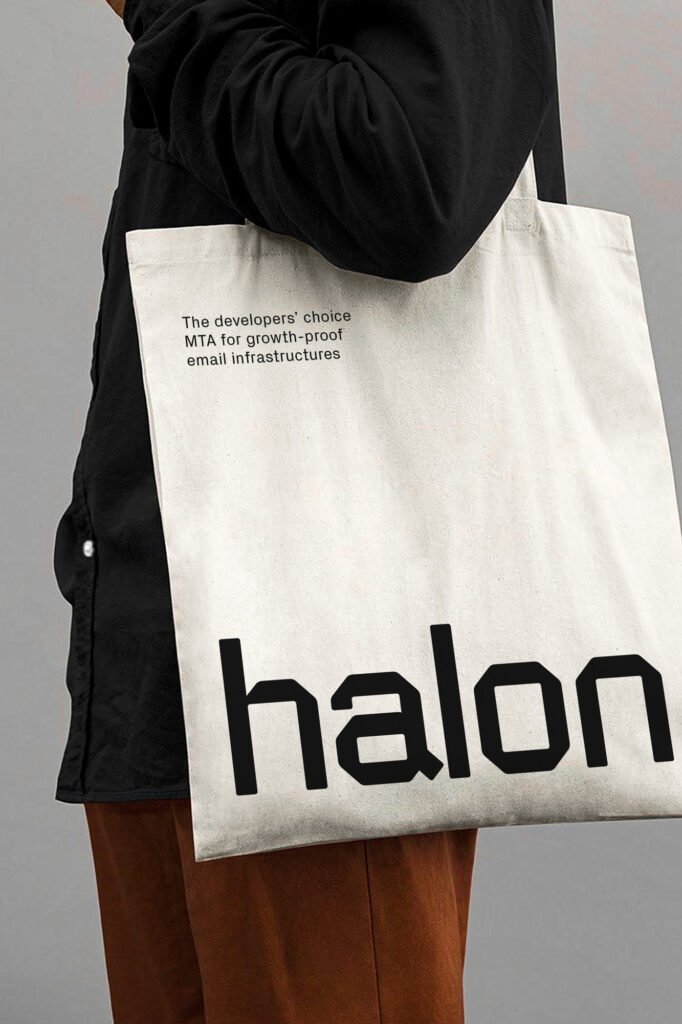
Front and center of this rebrand are the new logo and symbol. Coined the “Halon Molecule”, it represents Halon’s mentality and way of working to connect to new things, thoughts, and people to create growth. Forever changing and evolving, having Halon in your tech stack becomes more than the sum of its parts.
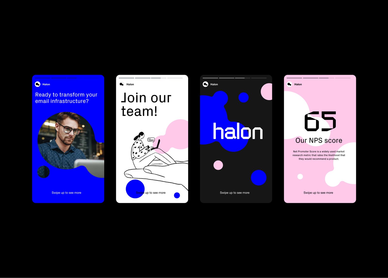
We refined Halon’s color palette to feel bold and “techy”, yet human. Our use of candid natural shots as part of our photography preferences realistic work settings of our end users – the dev team rockstars. We also commissioned a set of quirky hand-drawn illustrations that are a nod to the creative ideation process. After all, if you can dream it, you can build it with Halon.
“This (33% increase in leads) is a major milestone for Halon. The new strategy provides us with a unique opportunity to become synonymous with modern, developer-friendly and forward-looking email infrastructure”
- Anders Berggren, Co-founder & CPO, Halon
From crafting unique brand identities to designing intuitive websites and valuable content, we're here to execute your ideas. Contact us, and let's discuss your project.